Key driver analysis — mapping your way to increased customer satisfaction
Improving customer satisfaction comes down to figuring out what the customer is experiencing, what they care about, and how you’re going to address it. While something like not being digitally focused might be a general bump in the road to customers, not being responsive to their needs could be a detour that takes them away for good.
To determine those differences and the hierarchy of where you should focus business efforts, quantitative research and advanced analytics are used to produce a practical, visual tool: a key driver map.
What is a key driver map?
A key driver map is a graph that organizes individual aspects of a company based on performance and perceived importance to customers. Several advanced analytics techniques, including various types of regression, are run on survey responses to produce values for how well the company is performing in particular areas and how much customers care about those areas. The mean reported performance on attributes such as “responsive to my needs” or “communicates early” is graphed along the x-axis, while the level of importance of the attribute (i.e., satisfaction level or Net Promoter Score®) is graphed along the y-axis. Together, these data points provide direction on how the company can best achieve its business objectives.
What does a key driver map tell me?
Key driver maps are divided into quadrants and classify company attributes into four action-oriented categories: promote, maintain, monitor, and focus.
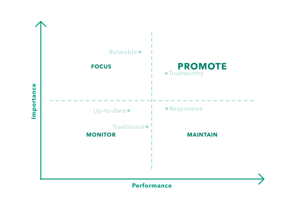
Promote
High performance, high importance
These are your money-making, protect-at-all-costs attributes. Characteristics of your company that fall in the “promote” section of the key driver map are ones that the company is currently delivering well on and that customers care about. You want to make sure to highlight these strengths when talking to prospective customers or developing marketing materials. They are also successes to praise internally — encourage employees to keep up what they’re doing in these areas by letting them know their work pays off.
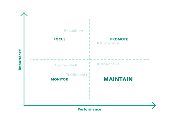
Maintain
High performance, low importance
Consider attributes that fall into the “maintain” portion of the key driver map as your “pat-on-the-back” attributes. Customers believe your company performs well on these operations or deliverables, but these attributes don't significantly influence satisfaction. You’ll want to keep doing what you’re doing in these areas, but there’s no need to invest additional resources on improving them.
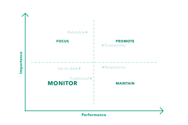
Monitor
Low performance, low importance
Imagine that the windshield wipers on your car are a little weak — you can still see when you have to use them, but it might not be crystal clear. It doesn’t require immediate attention, but it’s something to keep an eye on in case it gets worse.
The same is true for attributes in the bottom left-hand, “monitor” quadrant of a key driver map. These are areas where the company falls short, but customers aren’t too bothered by it — for now. Rather than immediately dedicating resources to address these shortcomings, monitor them to make sure they don’t begin negatively impacting your customers. Knowing that these areas are weaknesses, keeping a pulse on customers’ perceptions of them, and having a contingency plan are ways to proactively prepare if one of these attributes goes awry.
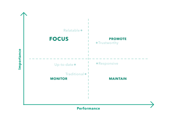
Focus
Low performance, high importance
*Cue the sirens* The upper left-hand quadrant is the one that raises red flags. Attributes in the “focus” quadrant are areas where the company is underperforming — and it’s negatively impacting customers.
Whether it’s ease of experience or overall trustworthiness, these are the attributes you need to address. This could be a more focused follow-up survey designed to dig into why customers reported performance as so low, an operational review to determine where processes might be broken, or even a community that helps customers feel more connected to your brand. While the approach may differ by attribute, the end-goal remains the same — move those data points along the x-axis to the upper right-hand side of the graph. However, it’s important to note that any improvement efforts should not be made at the cost of any of the company’s existing “promote” attributes.
Grab your map, start your engines
The road to positive NPS scores and elevated customer satisfaction levels isn’t always seamless. There’s bound to be some bumps, roadblocks, and even wrong turns. Using a key driver map to determine which attributes are essential to your customers’ satisfaction allows you to prioritize your time, money, and effort where it counts. Connect with a member of our customer experience team to start paving the way for happy customers.